Overview
The process of designing Bloc involved refining letterforms, exploring motion, and ensuring the typeface was versatile for both static and animated use.
Design System
Establishing a base system for the letter designs was essential to ensure cohesive letterforms.
Typeface
Developing both filled and stroke variations allowed for versatility while maintaining a unified aesthetic.
Application
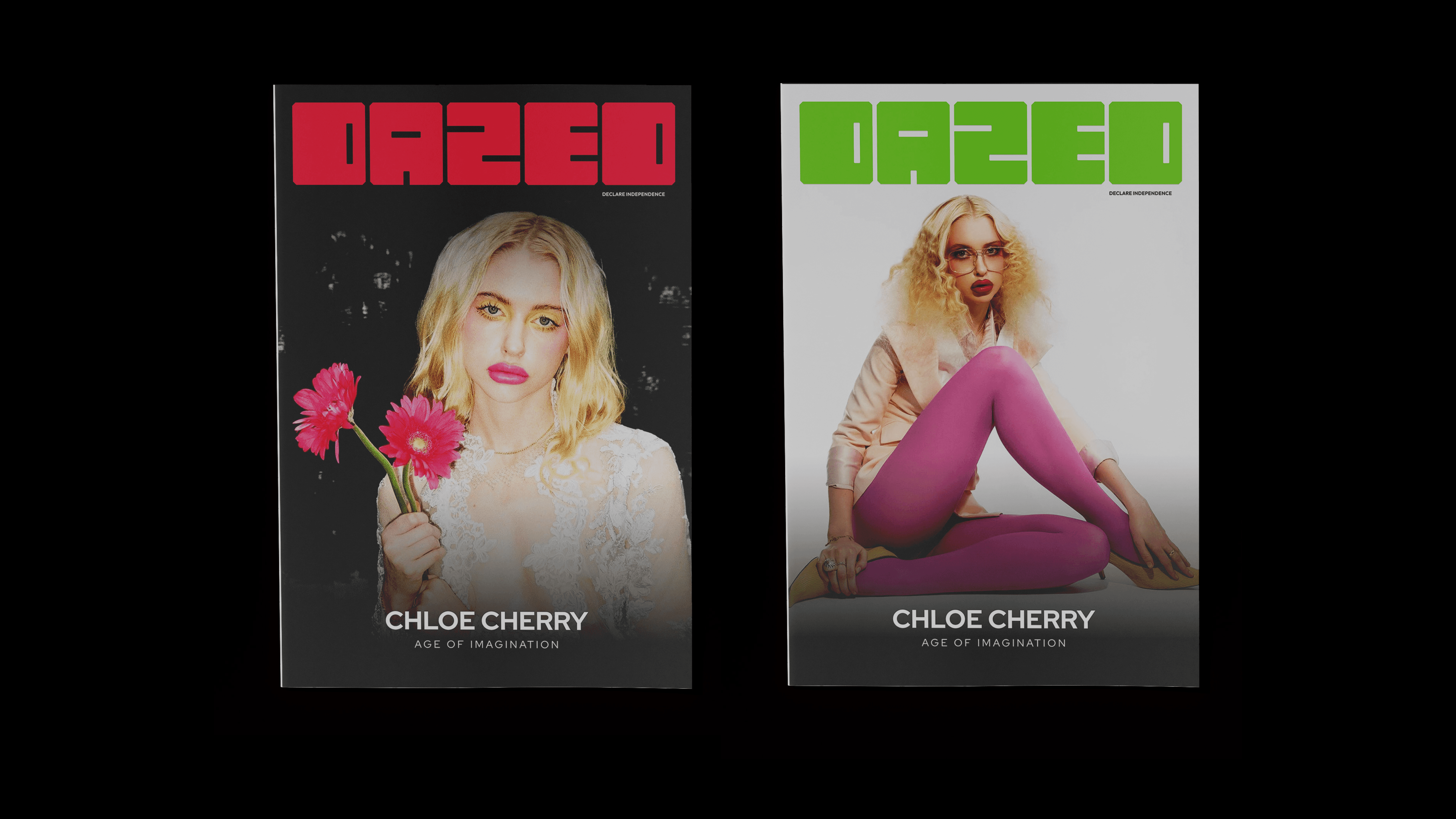
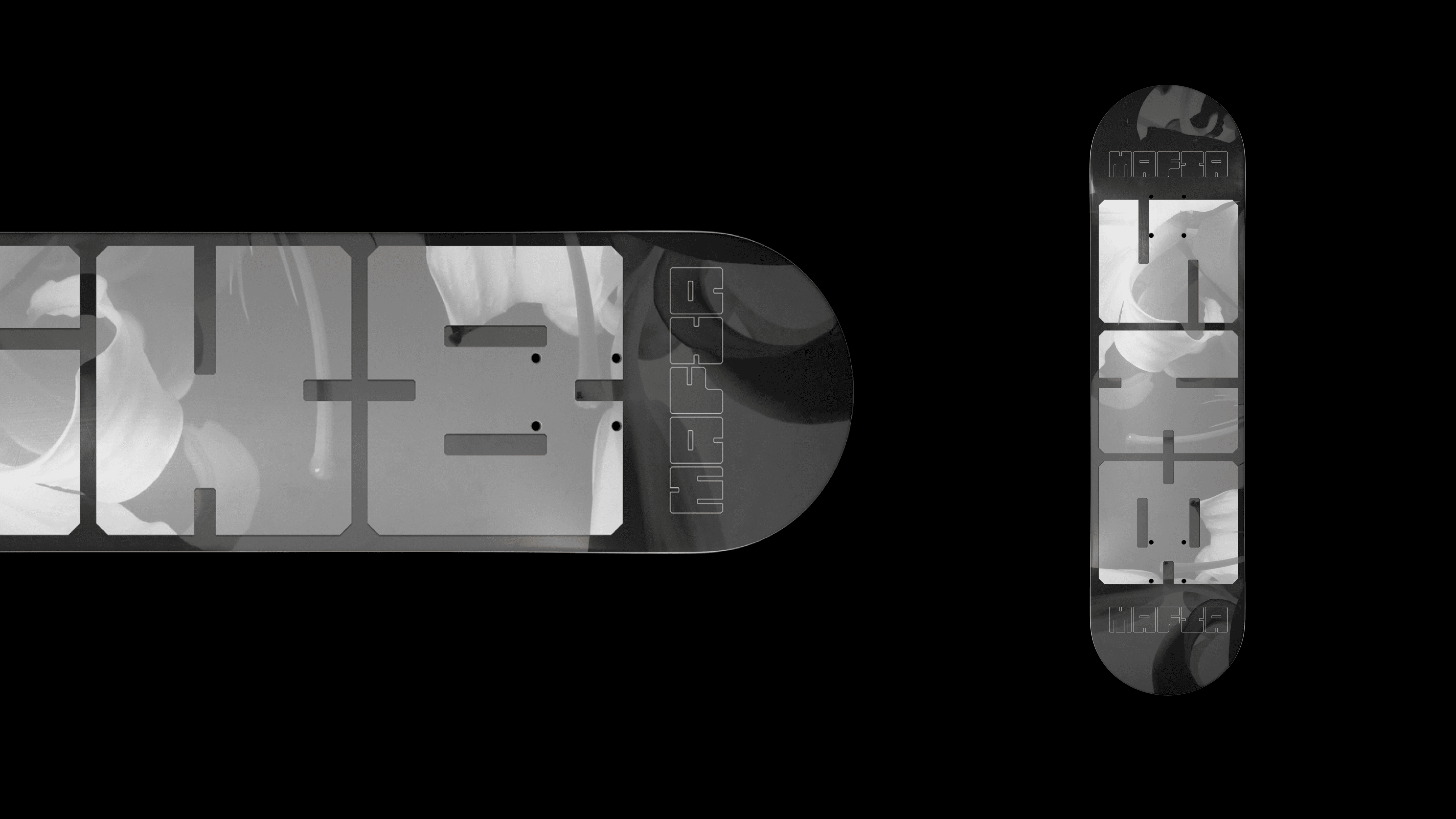
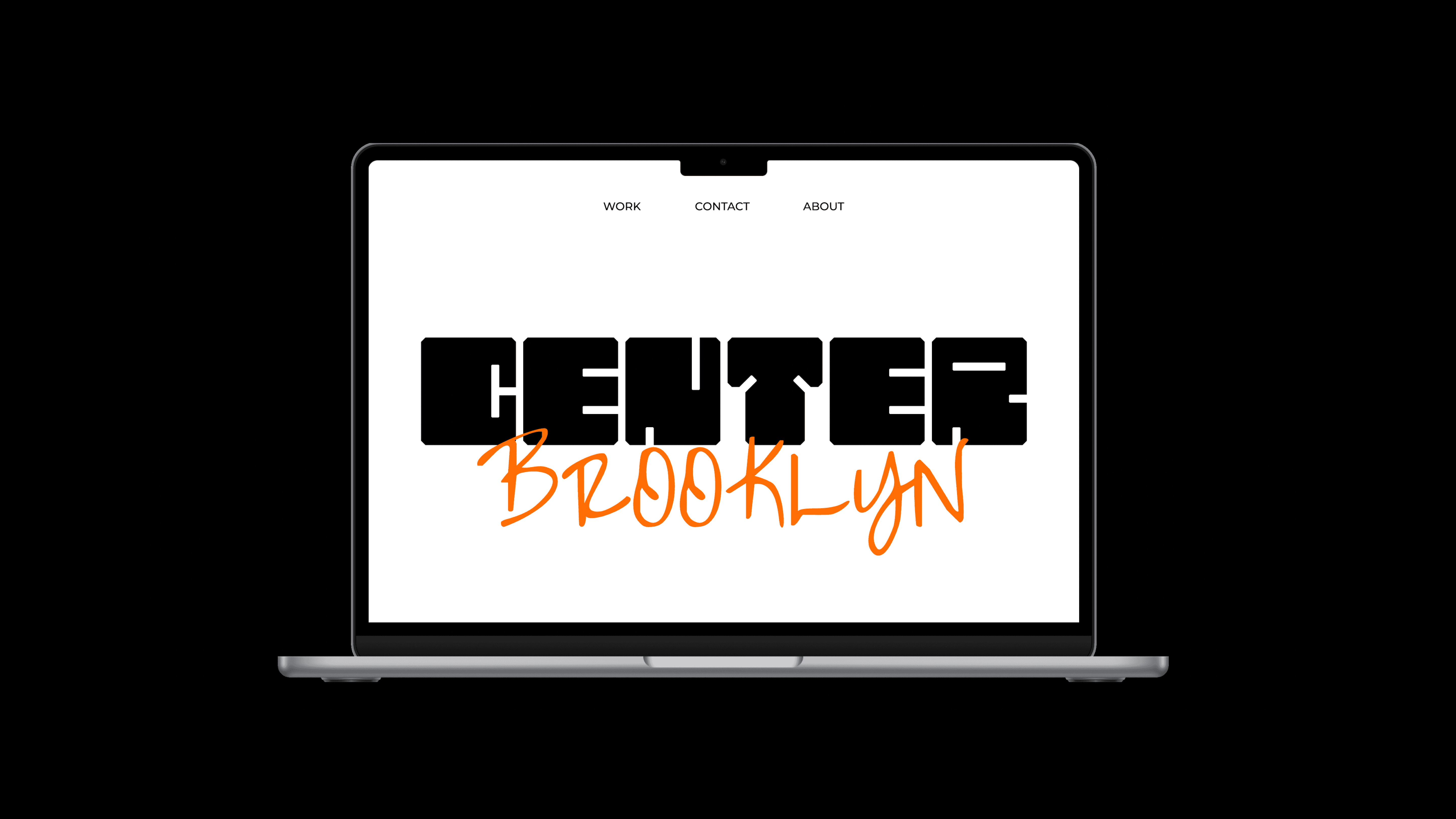
Showcasing the letterforms in context demonstrated their functionality in real-world applications.
Case Study
Integrating motion brought the letterforms to life, highlighting their dynamic potential.
Takeaways
Balancing Form and Function
Crafting a typeface required harmonizing visual appeal with practical readability.
Through constant refinement, the typeface moved closer to its intended personality.
Having fun allowed the typeface to develop a distinct, lively character.
Considering how the typeface responds in animation added depth and versatility.


