Product Identity
Usability Testing
Pain Points
Users wanted better search suggestions, saved history, and curated emails.
Users preferred an overlay for multitasking, fixed dialogue, and clear source labels.
Users need more precise responses and guidance on how to prompt VRA effectively.
Users requested export options and better data visualization to make insights clearer.
Final Implementation
Takeaways
Essential for staying competitive, following trends, and boosting user efficiency.
Firsthand feedback from long-time users helps eliminate design biases.
When dealing with large amounts of content, avoid overloading the user experience.
Ending a user flow with a next step or call-to-action strengthens platform engagement.
Membership Platform Redesign
Pain Points
The UI and design system were outdated, still using previous brand colors and fonts.
Research data is cluttered, making key insights hard to grasp.
Lack of clear distinction hinders navigation and user clarity.
Missed Opportunities
Not leveraging AI or new products missed opportunities for greater user engagement.
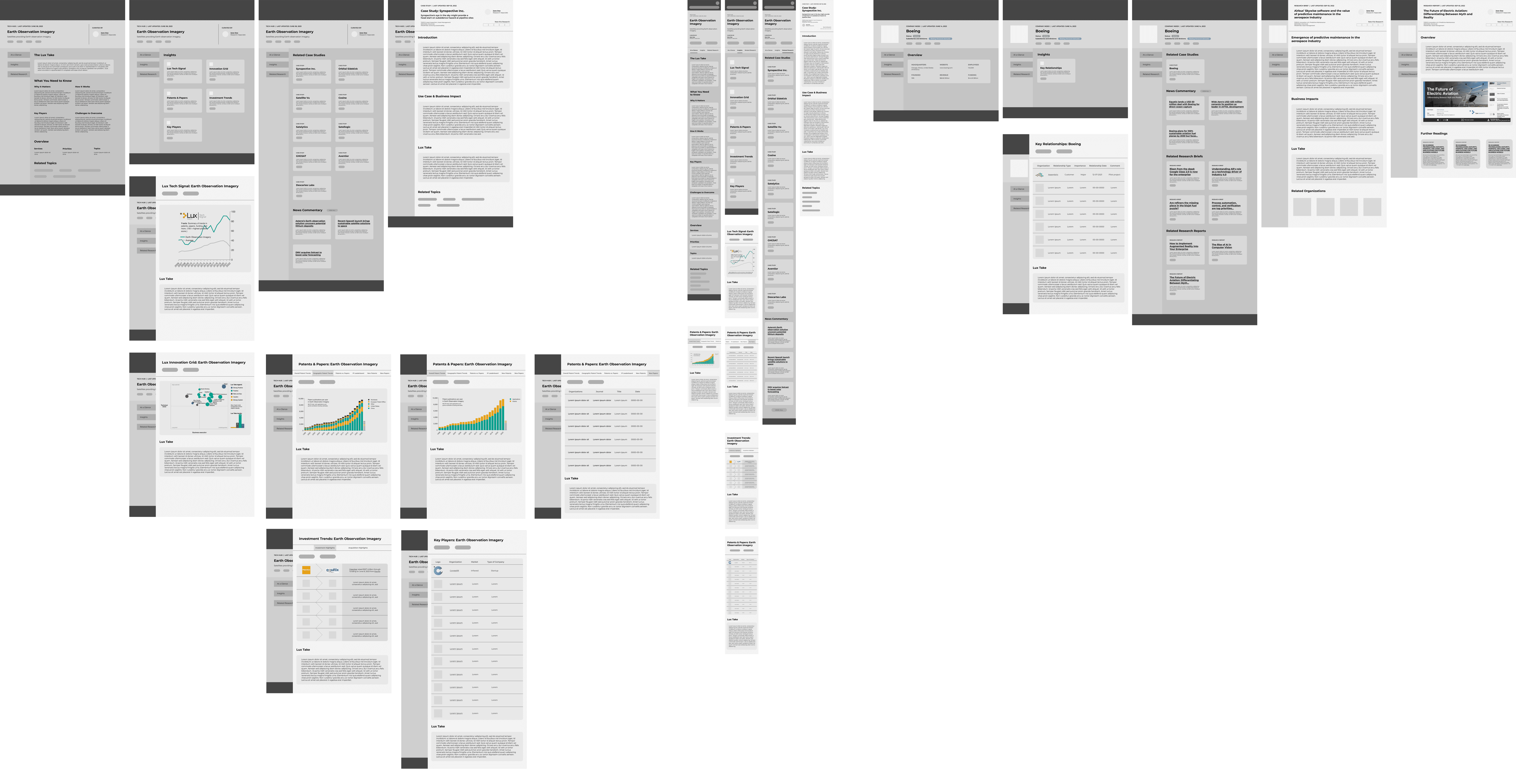
Wireframes
Membership Platform
Membership Platform
Membership Platform
Takeaways
Working with the dev team taught me how to adjust designs to meet technical needs.
Creating clear visualizations of complex data is essential for innovation leaders.
Many design iterations can be discouraging, but they lead you where you need to be.
Ensuring the redesign doesn’t confuse long-time users is crucial.


